Mike Connery
(Google) Mapping NYC Health Care Disparities
This fall, The Opportunity Agenda worked with a coaltion of New York City health advocates to influence the recommendations of The Berger Commission (aka the Commission on Health Care Facilities in the Twenty First Century, aka the hospital closures commission), which was tasked with "right sizing" New York's ailing Health Care system. As part of our work, we tried to conceive of an innovative way to show average New Yorkers the disproportionate - and negative - impact that hospital closures would have on low-income communities and communities of color.
 This week we launched the end-product of that work: Health Care That Works. We think it's an interesting example of the ways that new technology, research, and advocacy can be successfully combined, and we hope that it will serve as a case study to our colleagues, a resource to educate New Yorkers about their health care system, and - above all - a driver of civic and political action on this important issue.
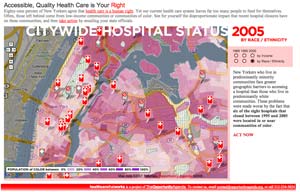
Health Care That Works is a Google Map mash-up designed to visually illustrate the economic and racial disparities that exist in New York City's health care system. The website overlays data on NYC hospital closures between 1985 and 2007 onto an interactive city-wide map that can display either the racial or economic demographics of the Five Boroughs during three distinct time periods: 1985, 1995, and 2005. Using this tool, visitors can visually see how hospital closures disproportionately impact poor neighborhoods and communities of color (this is particularly vivid in Central Brooklyn). Text on the sidebars guides the user through each decade and demographic overlay, explaining the changing conditions of the city and the impact that closures have on underserved communities.
But the site is more than just a visual resource to educate the public, it is also a data-rich resource for researchers that contains a variety of reports and fact sheets and an abundance of data on the patient demographics, payer source, and quality scores for each hospital. Nowhere else are these data sets presented together.
The site is also a community forum for health care advocates and New Yorkers, and an activism tool that encourages New Yorkers of conscience to write to their elected officials in support of creating a health care system that works equally for all.
When we discuss health policy in this country, very rarely do our public debates address the significant roles that race and class play in attaining access to quality health care. We hope our map shines a spotlight on those issues and sparks conversation among bloggers, researchers, policy makers, and citizens alike. Please have a look, email your friends, and then take a few moments to write to your state representatives with our action tool.
Mike Connery: Author Bio | Other Posts
Posted at 1:53 PM, Jan 18, 2007 in
Health Care | New York | Racial Justice
Permalink | Email to Friend